Support was receiving several tickets per week that people had trouble managing their subscription and billing settings. At the time we had 3 menu items that handled the task. Account, Billing settings, and subscription. We could see in Google analytics that a huge number of users visited “Account”, which essentially was just a way to set up their date and numbers format. The thesis is that these people wanted to visit one of the subscription pages. After setting up a funnel it appeared that a high number of visitors that visited “Account settings” went straight to Subscription or Billing settings afterwards, which confirmed the problem.
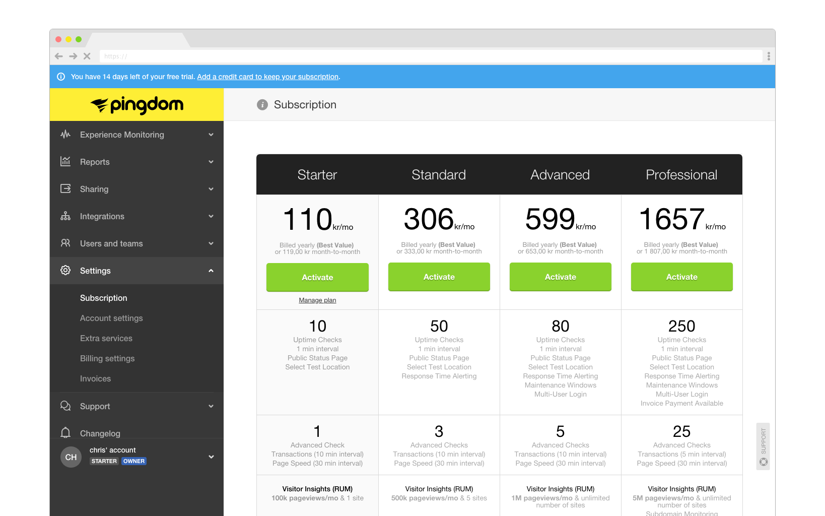
The old plan selector
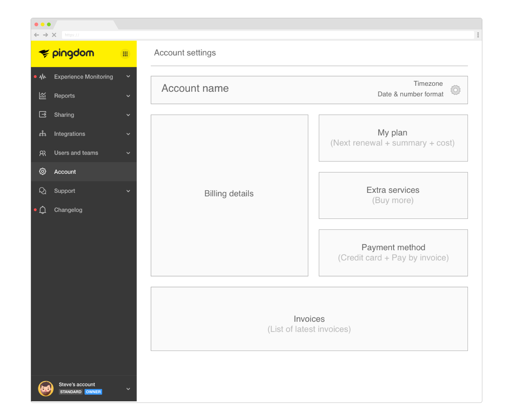
A Very early concept of my idea
After some initial competitor analysis along with interviews with Support and Sales, I wanted to create a one-stop-shop for all account/subscription related matters. A Hub where a user can get an easy to grasp overview of everything related to their Account.
Sales praised the concept. Support loved it. But here comes the kicker. My design colleagues wanted to keep everything separated still in the menu as 3 different items.
Why? Because “It is faster to click subscription in the menu, than to go to a page, then click it”.
I knew that would not solve the problem and i struggled to get my point across and eventually both Project owner, and my co designers started supporting the one-stop concept i was advocating.
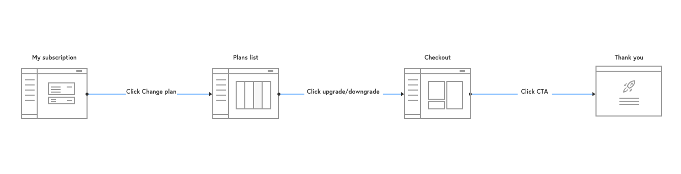
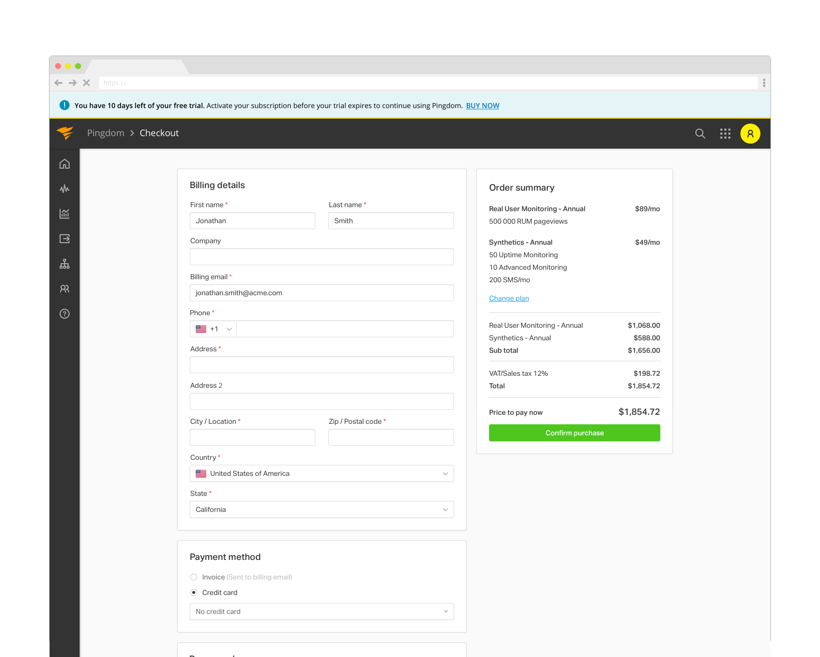
Change subscription plan flow
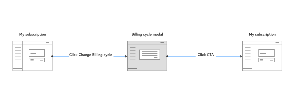
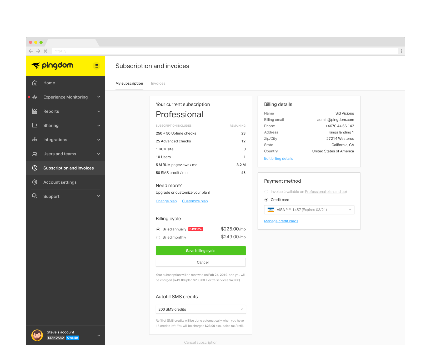
Change billing cycle flow
Cancel subscription flow
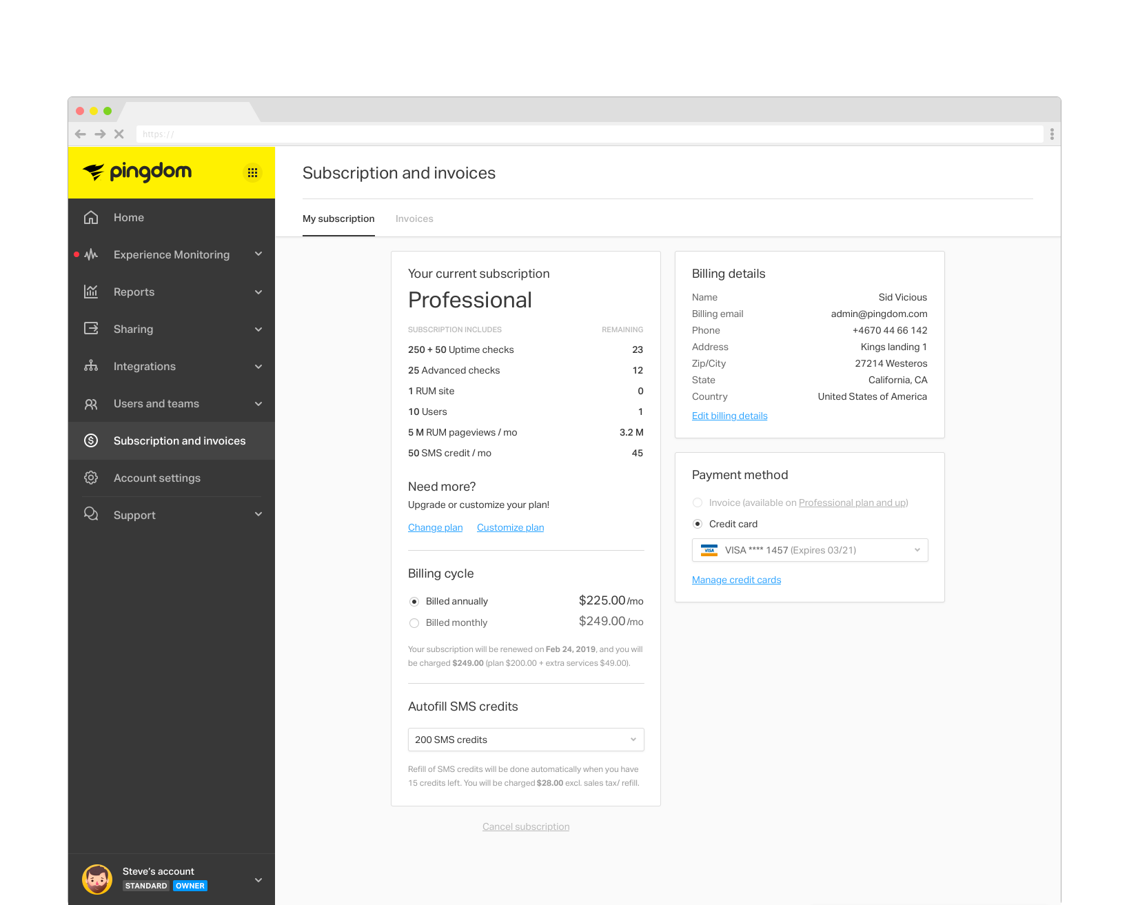
The result
One page to rule them all. A place where a user can see the current subscription plan and the remaining credits, current billing details, invoices and all related info to eliminate all confusion regarding setup and account handling.
From this page they can change what they need with a simple click to start a flow for that specific item.